My husband and I are about to embark on a dream trip that has been on our bucket list for years—Japan! We’ll be spending two weeks exploring Tokyo, Hakone, Kyoto, Osaka, and Hiroshima, immersing ourselves in the culture, history, and, of course, the amazing food.
We were intentional in planning our visit for April, hoping to experience the breathtaking beauty of cherry blossoms in full bloom. Seeing them in person has been a longtime dream, and we can’t wait!
During our travels, I won’t be posting on my blog, but I’ll be sharing updates, photos, and highlights on Facebook and Instagram—so be sure to follow along there!
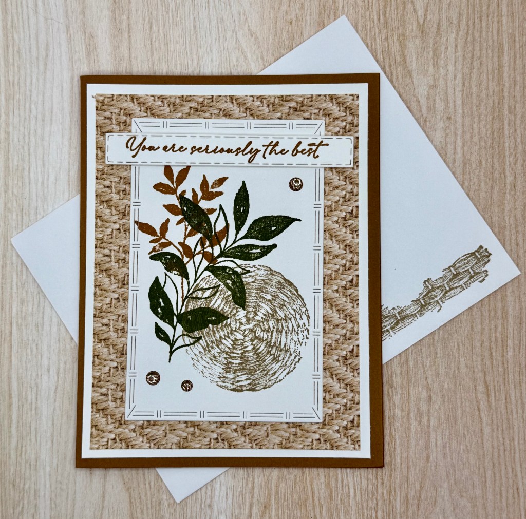
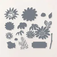
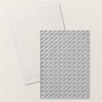
I’ve always loved a vintage look on a card, and I’m a huge fan of texture elements—so when I saw the Botanical Textures Suite Collection, I was instantly in love!
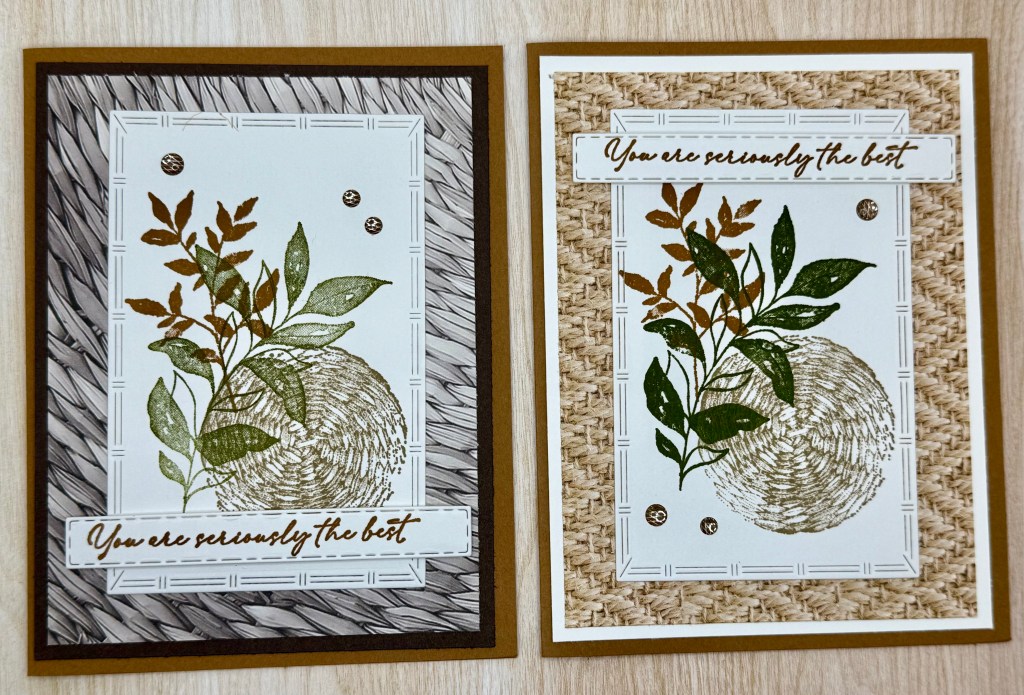
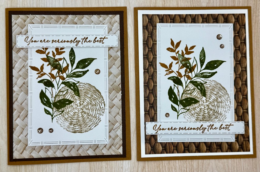
The Textured Notes Dies are one of my favorite features of this suite. Each rectangle has a unique edge design, adding beautiful variation and interest to the layout.
For this set of cards, I experimented with all the designs in the Designer Series Paper (DSP) pack, changing up the back layer to either Basic White or Early Espresso, depending on what best complemented the DSP.
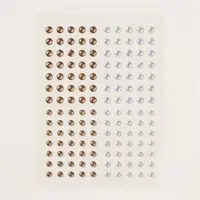
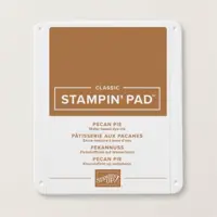
Instead of using the embellishments from the suite, I opted for Pecan Pie & Clear Ribboned Dots, simply because I had so many on hand. However, the Neutral Matte Dots would also be a great choice!
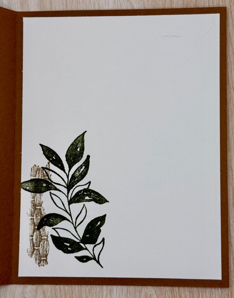
One of my favorite details is the basket weave stamp from the set—it’s too good not to use! I stamped it on the inside of the card and even on the envelope for a cohesive, finished look.
This collection has so many possibilities, and I can’t wait to create more with it!
Cardstock Cuts for this project:
Pecan Pie – 8-1/2″ x 5-1/2″ scored at 4-1/4 card base
Basic White – 5-1/4″ x 4″ inside panel, 5-1/4′ x 5″ panel (half the cards have this layer), 3-3/4″ x 3/4″ for Label Die, 4-1/4″ x 3″ for Rectangle Die
Early Espresso – 5-1/4′ x 5″ panel (half the cards have this layer)
Woven Textures DSP – 5″ x 3-3/4″ Panel
Stampin’ Up! products used to create this project:
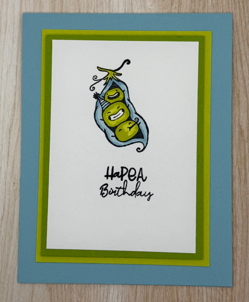
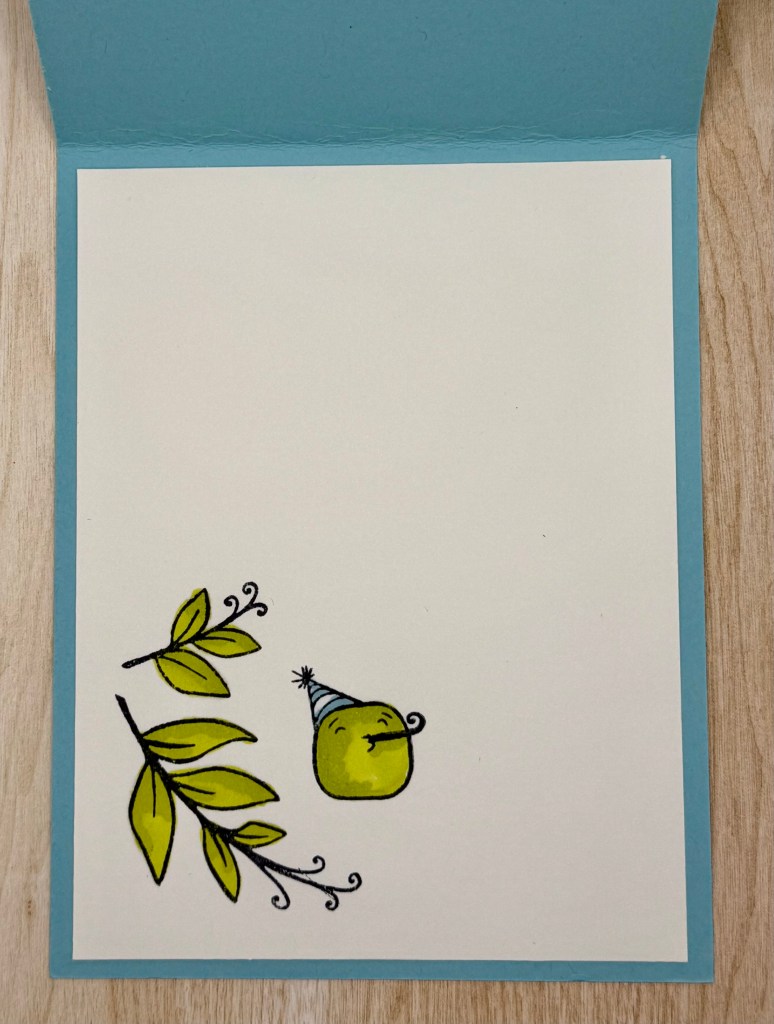
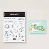
I couldn’t stop at just one! After making the baby card (here), I decided to create an adorable birthday card using the same Sweet Peas set and color palette. Just like the baby card, this design is super versatile—you can easily switch up the colors for a completely different look!
These little peas are just too cute, and I had so much fun coloring them with Stampin’ Blends! Adding shadows really brought them to life and gave them extra dimension.
To create contrast, I used Dimensionals to pop up and separate the Granny Apple Green and Lemon Lime Twist layers. And, of course, I couldn’t resist adding another sweet little pea to the inside of the card for an extra touch of charm.
Overall, this card is simple, fun, and perfect for any birthday celebration!
Cardstock Cuts for this project:
Balmy Blue – 11″ x 4-1/4″ scored at 5-1/2 card base
Basic White – 5-1/4″ x 4″ inside panel, 4-1/4″ x 3″ panel
Lemon Lime Twist – 4-3/4″ x 3-1/2″ panel
Granny Apple Green – 4-1/2″ 3-1/4″ panel
Stampin’ Up! products used to create this project:
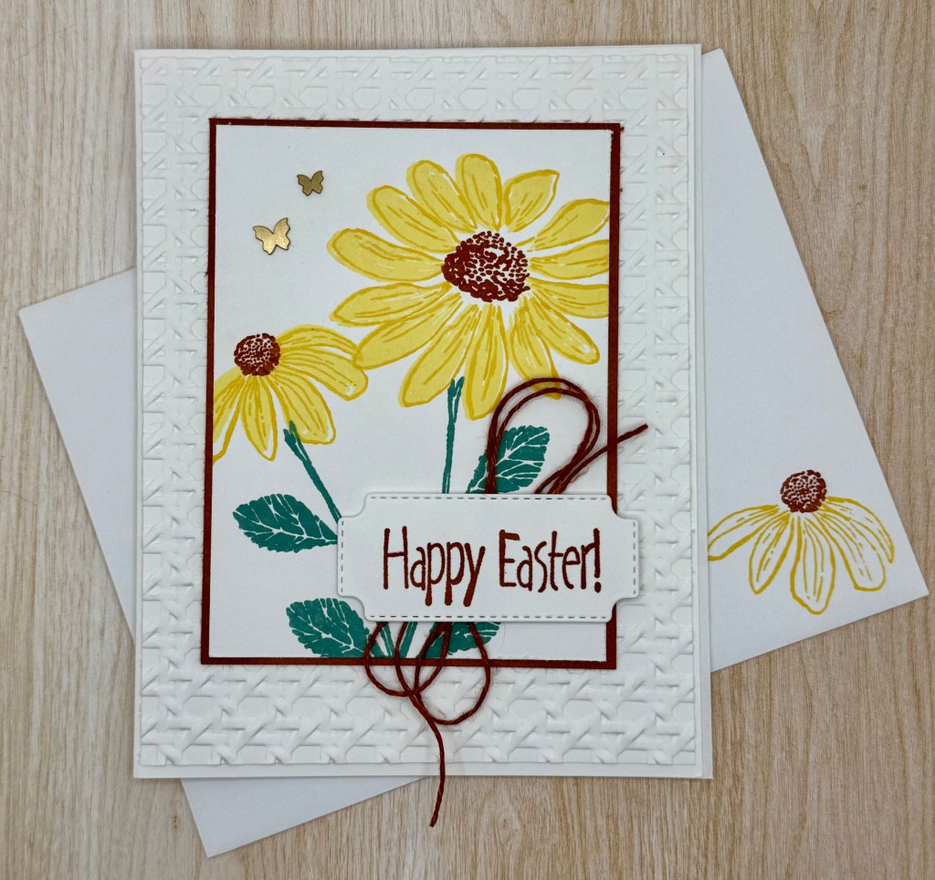
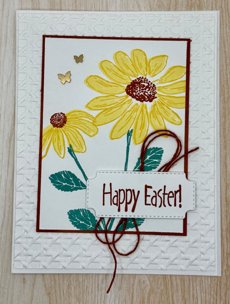
This year, I decided to take a break from the traditional bunnies and chicks and create a more subtle Easter card. The best part? This design is perfect for any occasion! Simply swap out the tag or leave it off entirely for a more versatile look.
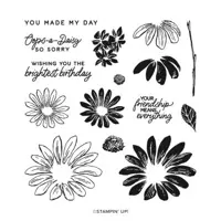
The Cheerful Daisies stamp set was the perfect choice for this card, with its beautiful two-step stamping that brings the daisies to life with stunning depth. To add texture, I used the Cane Weave Embossing Folder, which mimics the look of a woven basket—such a fitting touch for Easter!
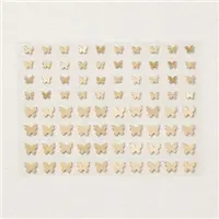
My favorite detail has to be the delicate butterfly embellishments. They add just the right amount of charm and elegance.
I also love incorporating a coordinating element on the inside of the card to tie everything together with the front. It’s those little details that make handmade cards so special!
Cardstock Cuts for this project:
Basic White Thick – 8-1/2″ x 5-1/2″ scored at 4-1/4 card base
Basic White – 5-3/8″ x 4-1/8″ panel for Embossing Folder, 4″ x 3″ panel, scrap for Label Die
Copper Clay – 4-1/8″ x 3-1/2″ panel
Stampin’ Up! products used to create this project:
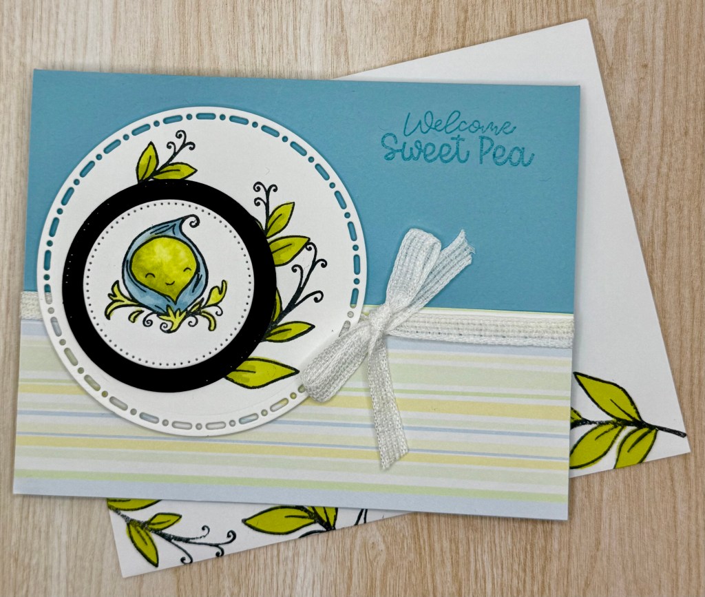
One of my coworkers is expecting a baby boy in May, so we recently gathered for a small lunch to celebrate her. As part of the festivities, I made a special card from all of us. While browsing Stampin’ Up! for inspiration, I instantly fell in love with the Sweet Peas set—it was just too perfect for the occasion!
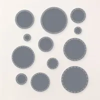
To create the design, I used the Spotlight on Nature and Stylish Shapes Dies to cut out the circles on the front. I saw a fellow stamper use a similar technique and loved how she tucked the leaves behind the smaller circles, adding a beautiful layered effect. To give the card extra dimension, I popped up the largest circle with Dimensionals.
For the coloring, I used Lemon Lime Twist and Balmy Blue Stampin’ Blends to bring the leaves and sweet little pea pod to life. One of the things I love about this design is its versatility—you can easily switch up the colors for a baby girl or go with gender-neutral tones for a surprise arrival.
It was so much fun creating this card, and I hope it brings a smile to the mom-to-be!
Cardstock Cuts for this project:
Balmy Blue – 8-1/2″ x 5-1/2″ scored at 4-1/4 card base
Basic White – 5-1/4″ x 4″ inside panel, Circle Dies
Basic Black – Circle Die
Retired Designer Series Paper (DSP) – 5-1/2″ x 2″
Stampin’ Up! products used to create this project:
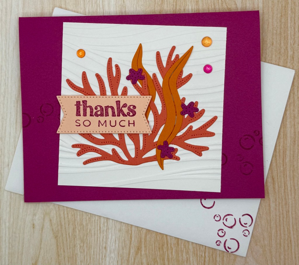
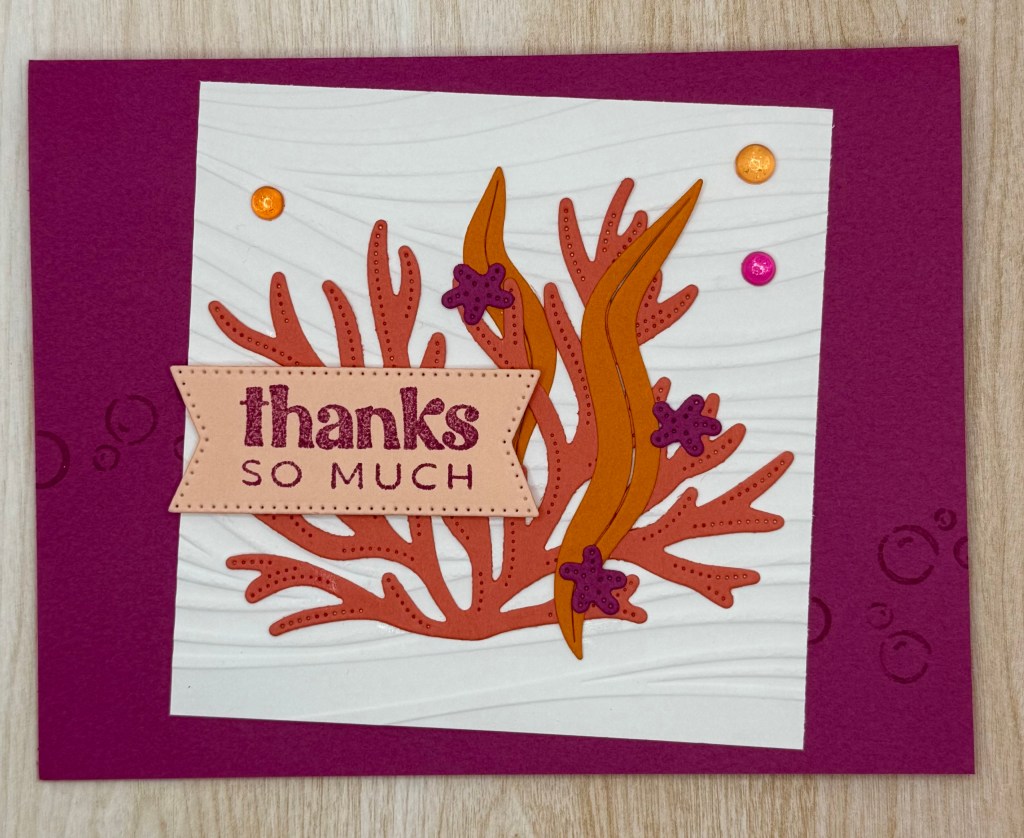
Living in Florida, I love creating water and beach-themed cards—they’re always a hit! And for my friends up north, I hope this card brings a little sunshine your way and reminds you that Spring is on its way!
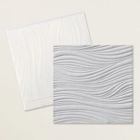
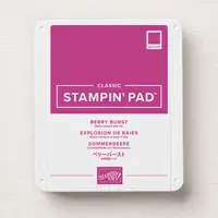
While I don’t often reach for bold, bright colors, I have to say that this combination of Berry Burst, Pumpkin Pie, and Calypso Coral is absolutely stunning! To add texture, I embossed a Basic White square with the Soft Waves Embossing Folder before adhering it to the card base. (Tip: Don’t forget to stamp those adorable bubbles on the base first!)
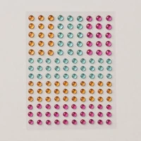
For the underwater elements, I used the Fine-Tip Glue Pen to carefully adhere the coral, starfish, and seaweed. The sentiment, die-cut from Stylish Shapes, is popped up with Dimensionals for added depth. And to finish it off, I couldn’t resist adding some Sunny Day Iridescent Dots for that perfect ocean sparkle!
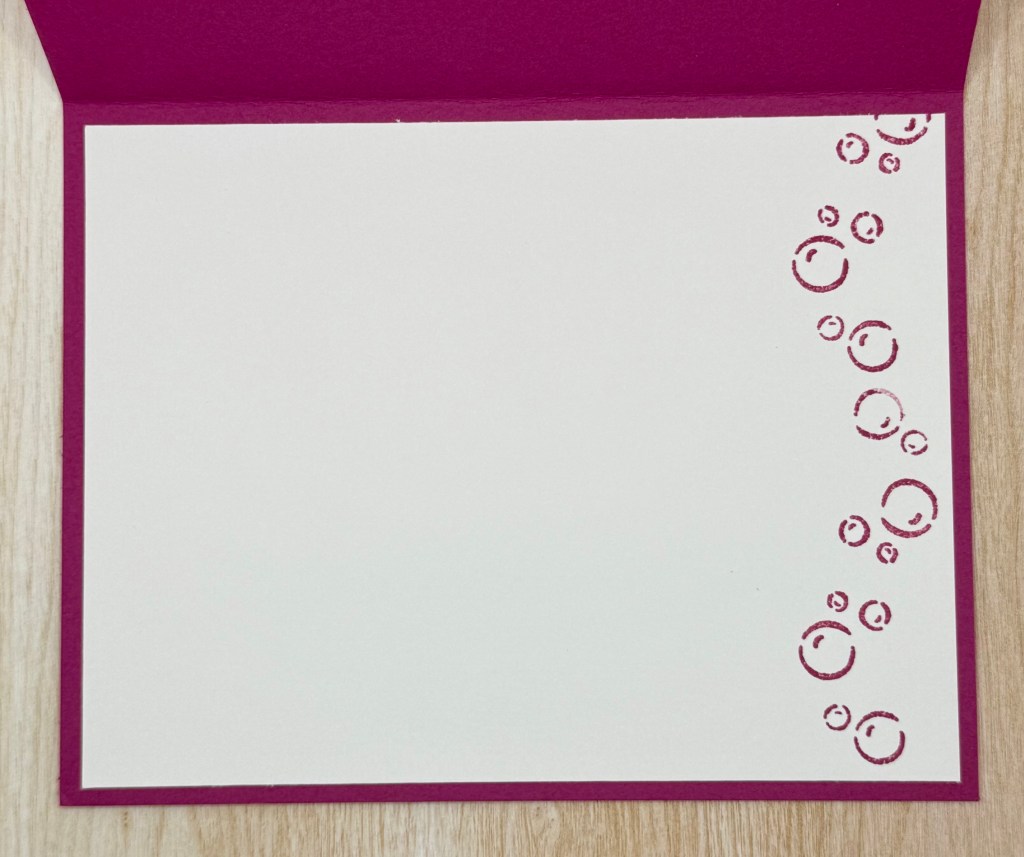
I loved the bubbles so much that I carried them into the inside of the card and onto the envelope—because why not add a little extra fun?
I hope this inspires you to create something colorful and cheerful. Let me know if you give it a try!
Cardstock Cuts for this project:
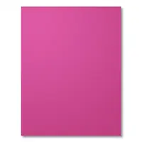
Berry Burst – 8-1/2″ x 5-1/2″ scored at 4-1/4 card base, scrap for Starfish Dies
Basic White – 5-1/4″ x 4″ inside panel, 3-3/4″ x 3-3/4″ panel for Embossing Folder
Petal Pink – 2-1/2″ x 1-1/4″ for Label Die
Calypso Coral – 3-3/4″ x 3″ for Coral Die
Pumpkin Pie – 3-1/4″ x 1-1/4″ for Seaweed Die
Stampin’ Up! products used to create this project:
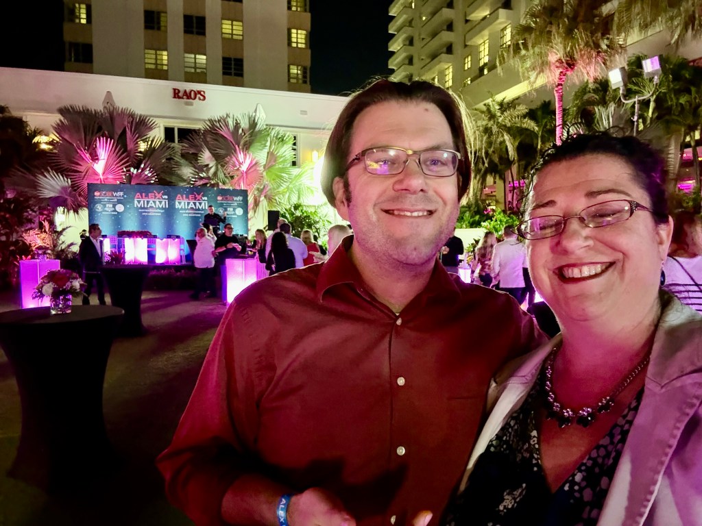
Nathan and I had the incredible opportunity to attend a couple of events at this year’s South Beach Wine & Food Festival (SOBEWFF) in Miami. As foodies and big fans of Food Network, this festival is always a dream come true!
The first event we attended was Alex vs. Miami, a fun twist on the show Alex vs. America. Around 25 local chefs prepared their best dishes to compete against celebrity chef Alex Guarnaschelli. The judging panel featured Kardea Brown, Jeff Mauro, Aarti Sequeira, and Geoffrey Zakarian, while Eric Adjepong hosted the event.
One of the best parts? As attendees, we got to sample every dish! There were some truly outstanding plates, but in the end, Cheese Burger Baby took home the win. Beyond the competition itself, we also spotted several other chefs we’re huge fans of, making the night even more exciting.
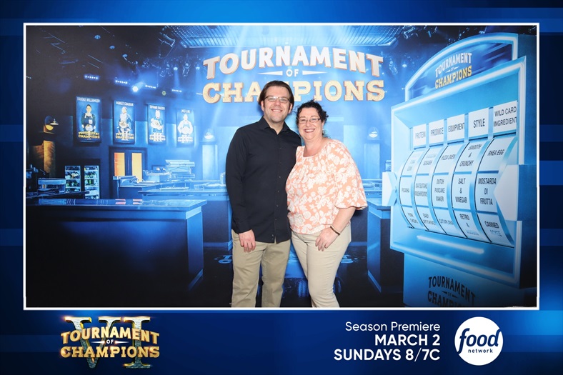
The second event we attended was the Tournament of Champions showcase—an amazing Christmas gift from Nathan! We are massive Tournament of Champions fans and closely follow many of the chefs who compete. Getting to see them in person was an absolute thrill.
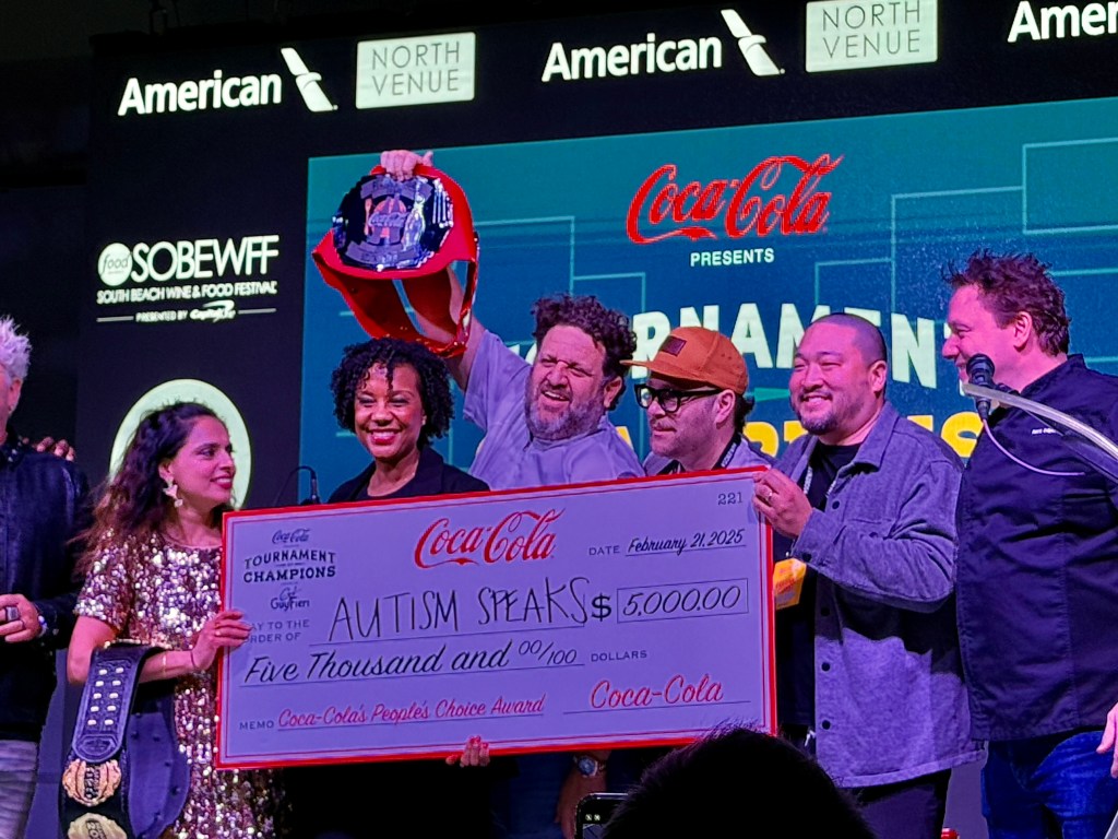
The event was set up with four teams, each led by a past Tournament of Champions winner: Brooke Williamson, Maneet Chauhan, Tiffani Faison, and Mei Lin. Each team had six chefs, and attendees tasted every dish before voting for their favorite. The team with the most votes won a donation for their lead chef’s chosen charity.
Maneet Chauhan’s team took the win! Nathan and I didn’t completely agree on a favorite dish, but ironically, both of our top picks were from Maneet’s team.
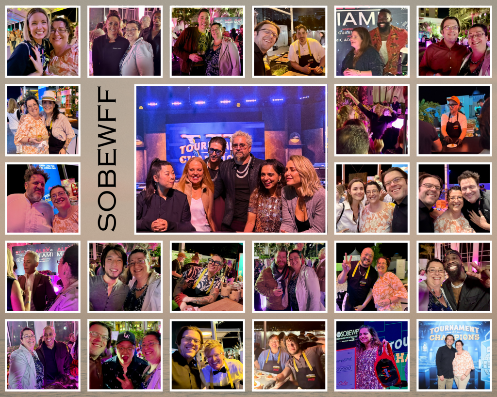
We had an amazing time indulging in incredible food and meeting some of our favorite chefs. For all the foodies out there, check out the collage below of all the chefs we follow and got pictures with—how many do you recognize?
Also, don’t forget—Tournament of Champions premiered last night! If you haven’t watched it yet, you definitely should.
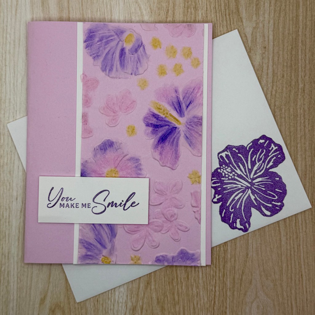
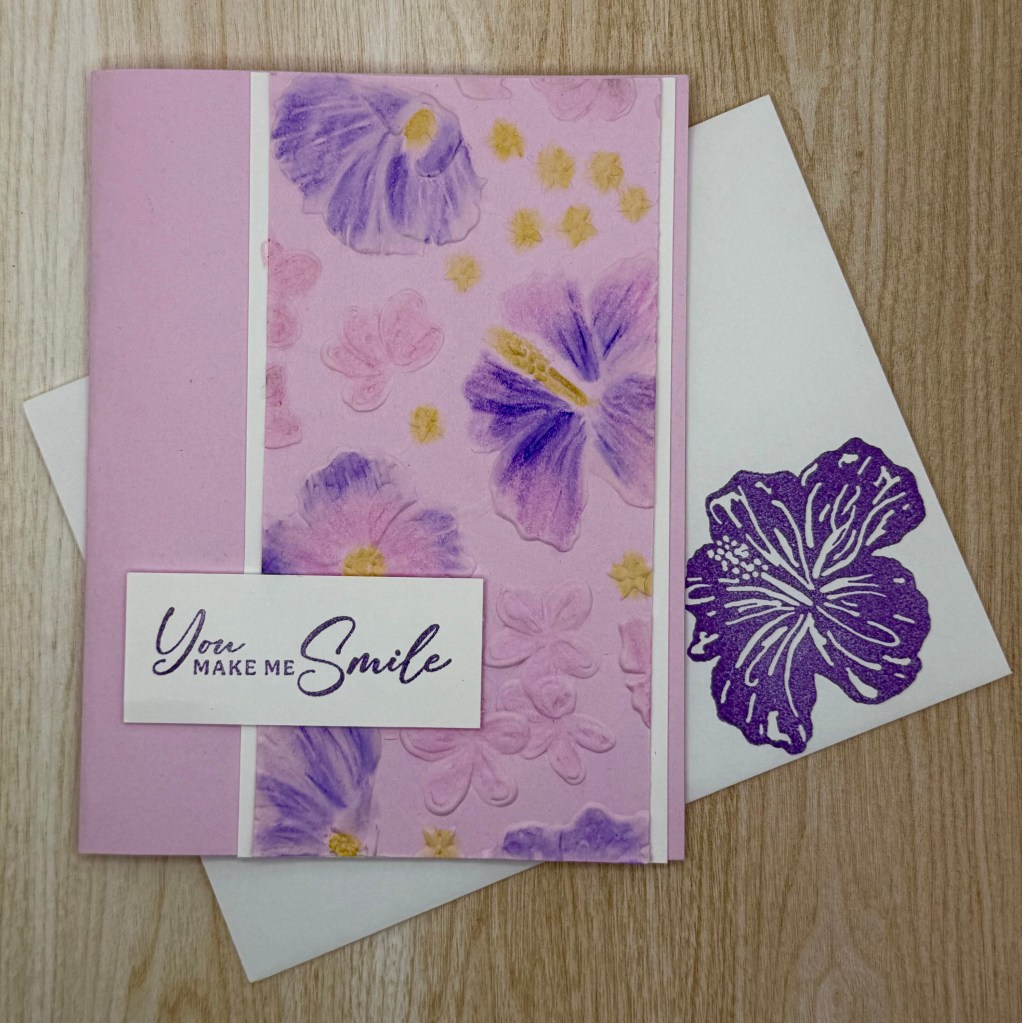
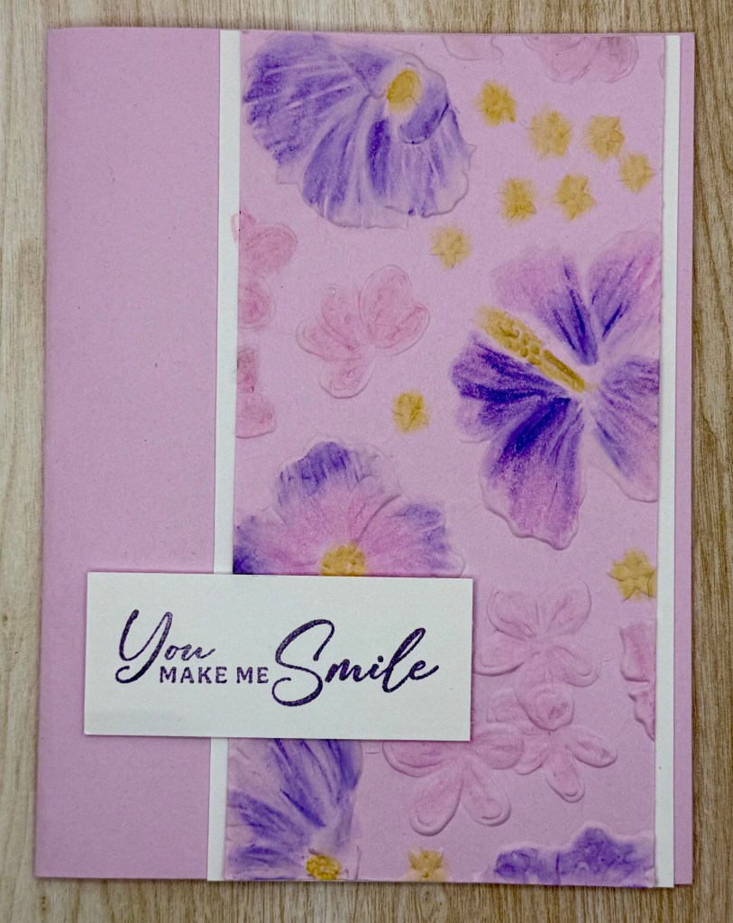
We all love to color, but why not take it to the next level? In today’s project, I’ll show you how to create a beautifully soft, painted effect using Stampin’ Up! Watercolor Pencils and a Blender Pen—no actual painting skills required! Be sure to check out the technique video to see this method in action.
For this card, I started by embossing a floral panel and then bringing it to life with watercolor pencils and blending. To keep the focus on the artwork, I layered it onto a simple white background before adhering it to the card front. The sentiment was popped up with Stampin’ Dimensionals for extra depth.
To tie everything together, I added a coordinating hibiscus inside the card and on the envelope—because a little extra detail makes all the difference!
Give this technique a try, and let me know how it inspires your next project!
Technique Highlight: Watercolor with Colored Pencils and Blender Pens
Cardstock Cuts for this project:
Bubble Bath – 8-1/2″ x 5-1/2″ card base scored at 4-1/4″, 5-1/2″ x 2-3/4″ panel
Basic White – 5-1/4″ x 4″ panel, 5-1/2″ x 3″ panel, 2-1/2″ x 1″ panel
Stampin’ Up! products used to create this project:
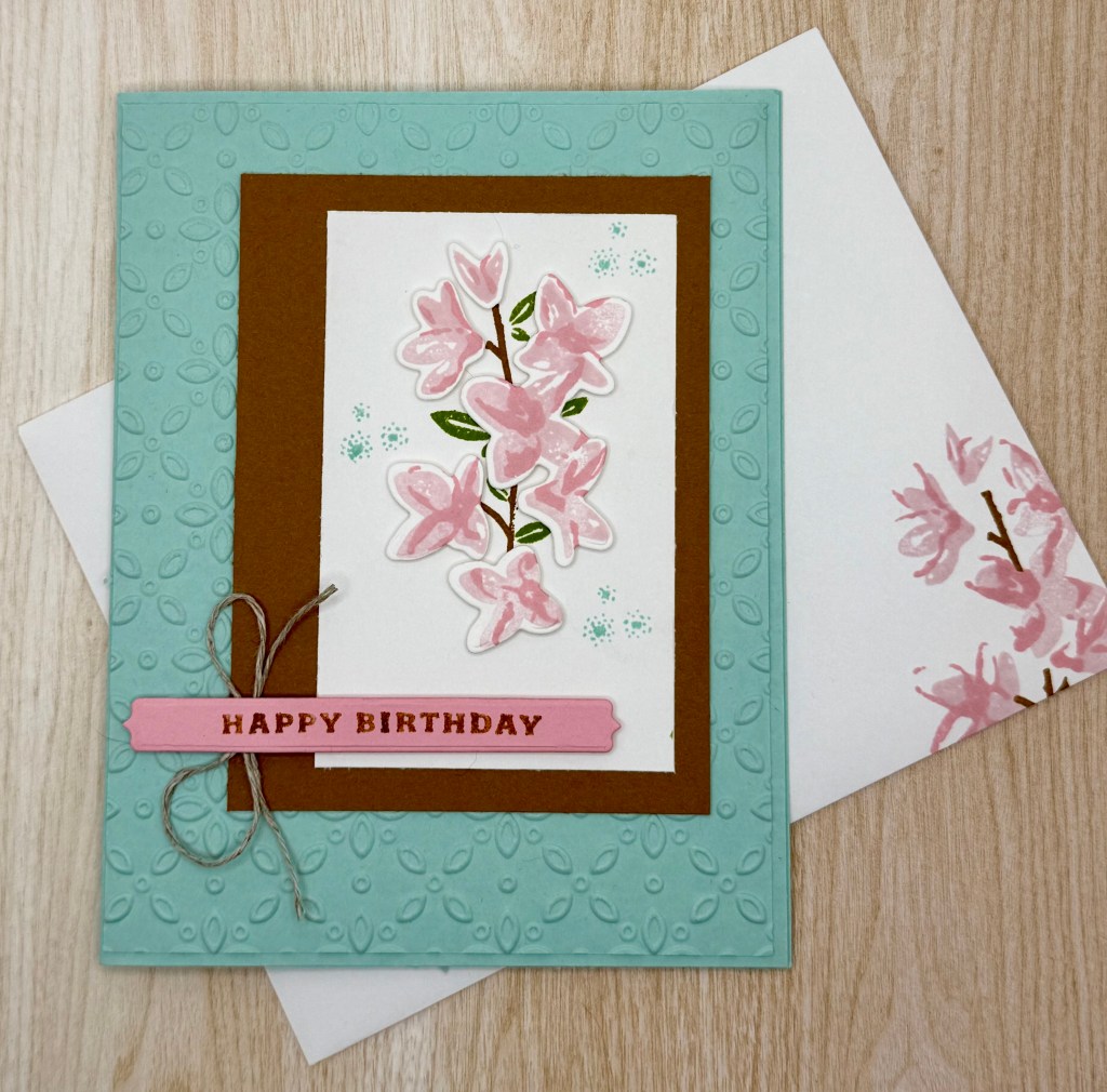
If you’re looking for a versatile birthday card for any month of the year, this design is a perfect option. I love keeping a stack of cards on hand for birthdays, thank yous, and other occasions, and this card will be my go-to for birthdays this year. While I sometimes use themed designs, this one is especially handy for those office birthdays that tend to sneak up on me!
For the flowers, I chose pink to give a cherry blossom look, but you can use any color palette that inspires you. Customizing colors allows for endless variations and makes it easy to personalize the card for different recipients.
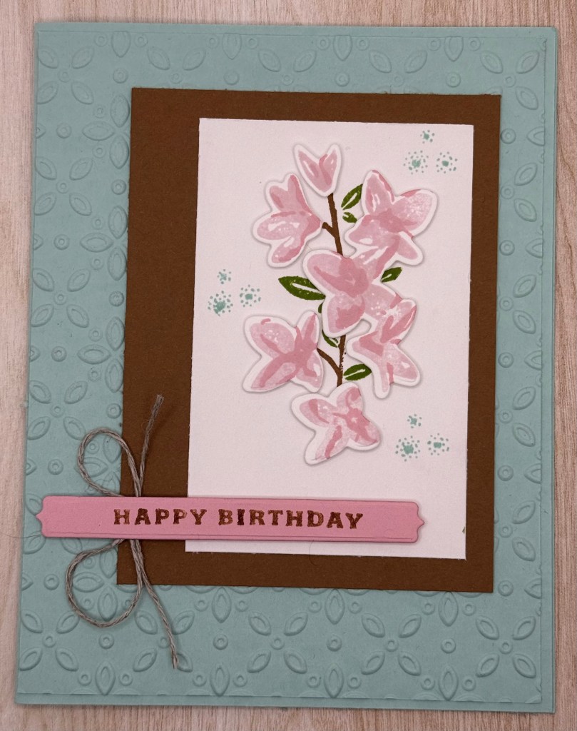
To create the front of the card, I stamped two-step flowers on a scrap of white cardstock and die-cut them. Using Dimensionals, I popped the flowers up to add depth and placed them on top of the stamped stem and leaves. This layering technique brings the floral design to life with added dimension.
For the card base, I embossed a layer of cardstock in the same color as the base. This added texture without affecting the inside of the card, which remains smooth—just a personal preference that I find neat and practical.
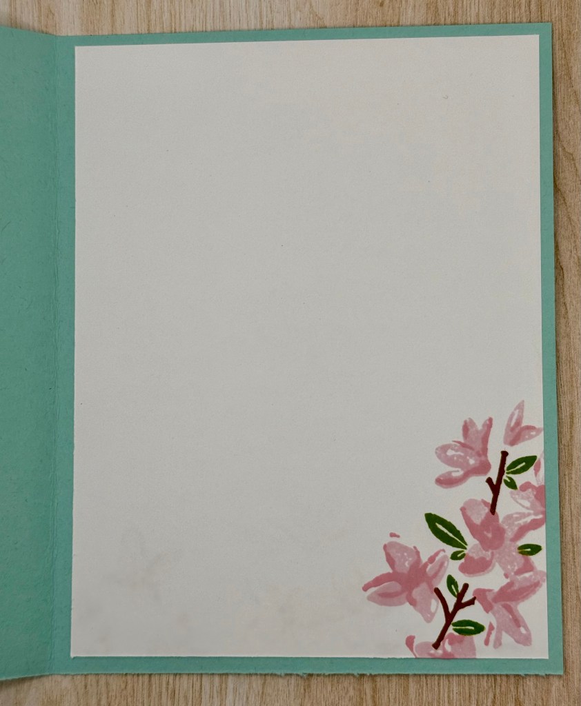
For the inside of the card, I stamped all the layers of the flower design to tie everything together. The cohesive design creates a thoughtful, handmade touch that I love.
This card is simple yet elegant, making it a great staple for any card stash. Whether you’re preparing for planned celebrations or those last-minute surprises, this design is sure to impress!
Cardstock Cuts for this project:
Pool Party – 8-1/2″ x 5-1/2″ scored at 4-1/4 card base, 5-3/8″ x 4-1/8″ panel
Basic White – 5-1/4″ x 4″ inside panel, 3-1/2″ x 2-1/4″ panel, 3″ x 2″ panel
Pretty in Pink – 3-1/2″ x 1/2″ for Label die
Pecan Pie – 4″ x 3″ panel
Stampin’ Up! products used to create this project:
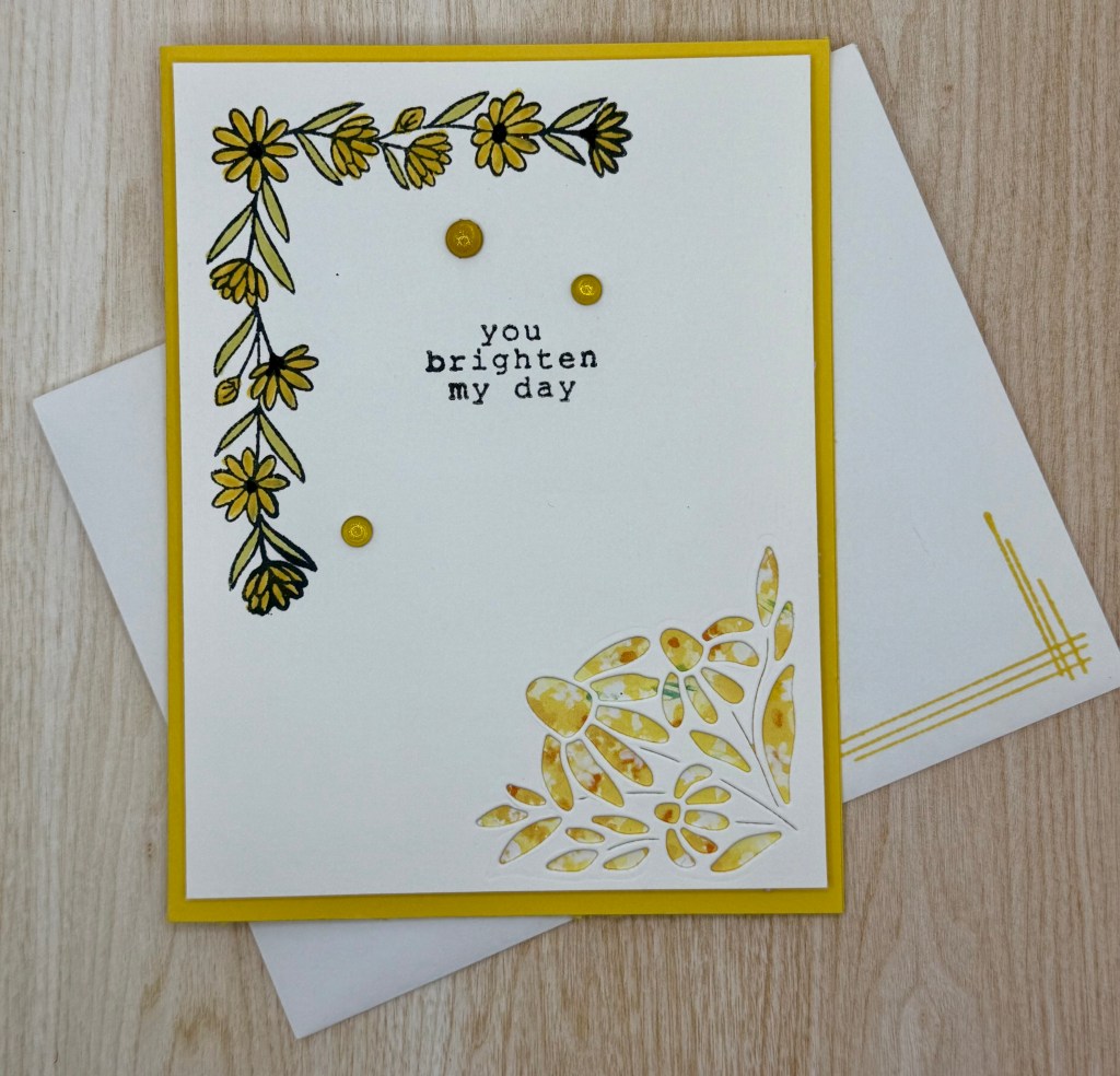
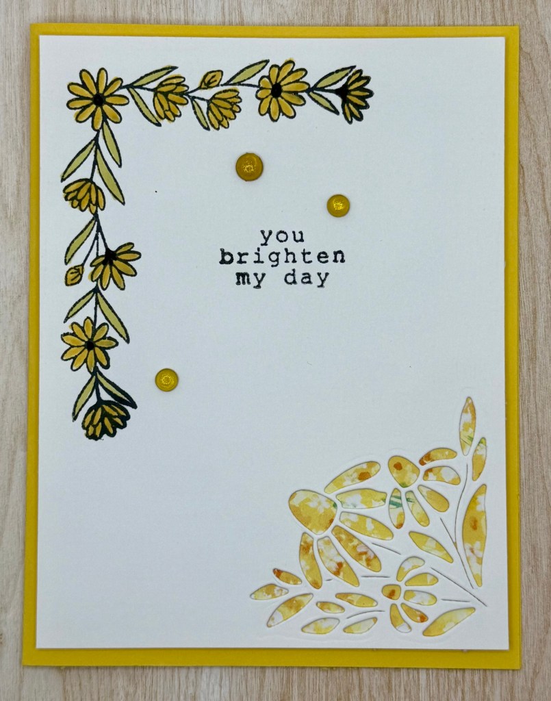
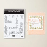
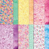
This card features a simple yet elegant design, making it perfect for a variety of occasions. It showcases the Corner in Bloom Stamp Set and Bloom Impressions DSP, both of which are exclusive to Sale-A-Bration—but hurry! This promotion ends at the end of the month, so be sure to place your order before these beautiful products are gone.
The floral design comes from the Corner in Bloom stamp set. To bring the flowers to life, I used Stampin’ Blends for a soft and vibrant touch.
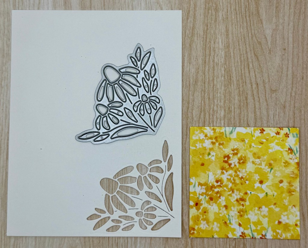
For the focal point, I die-cut the bottom corner of a white cardstock layer using the Spring Corners die. To create a colorful backdrop, I adhered a piece of Bloom Impressions DSP behind the cutout, allowing the floral pattern to peek through. This entire layer is then attached to the card base using Dimensionals, adding depth and interest. It’s a simple yet stunning technique that’s easy to recreate!
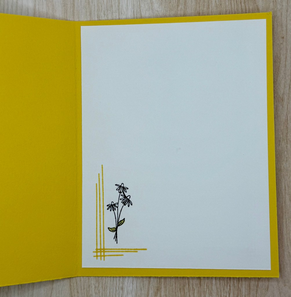
One of my favorite details is the lines stamp from the Spring Corners set. It provides such a subtle yet striking accent, as you can see on the inside of the card.
I hope this project inspires you to create something beautiful. Don’t forget—Sale-A-Bration ends soon, so grab these exclusive products while you still can!
Cardstock Cuts for this project:
Daffodil Delight – 8-1/2″ x 5-1/2″ scored at 4-1/4 card base
Basic White – 5-1/4″ x 4″ inside panel, 5-1/4″ x 4″ panel
Bloom Impressions DSP – 2-1/2″ x 2-1/2″ panel
Stampin’ Up! products used to create this project:
I am a project manager by day and a crafter by night. I love Christmas and want to do it all every year. I will share with you how I do it and enjoy it too!